

What I did
Research
Brand Strategy
Brand Building
Logo Creation
Marketing
Product Design
Overview
LILT is a physical audio journal and accompanying app that allows users to go into nature and capture their memories through ambient sound. It offers a slower, more grounded way to document your journey through listening. By tuning into the natural world and collecting moments through sound, users are invited to be present, to observe, and to reconnect with their environment without relying on typical screen-based documentation.
Tools
Illustrator
Photoshop
Sketchbook
Procreate
Figma

Competitive Analysis
Lilt stands apart from competitors like Terra, Soundscapes, and basic tools like Voice Memos by offering a deeply personal, emotionally rich way to connect with nature through sound. While Terra focuses on environmental data collection and Soundscapes emphasizes archival sound mapping, Lilt is rooted in storytelling and memory-making centered on the feeling of being present. Unlike utilitarian tools, Lilt begins as a physical journal first, encouraging users to slow down, listen, and “press” ambient sounds into memory like one would a flower between pages. This tactile-first approach invites a deeper connection with place and self, something tools like Voice Memos lack entirely. Where others record sound, Lilt captures moments.

Users of LILT
To shape Lilt’s brand, I developed three key personas (Chris, Lily, and Matt), each representing a different way people connect with nature and memory. Chris, 25, is an outdoor gear retailer and avid climber who uses Lilt to capture the ambient sounds of his climbing and hiking adventures while disconnecting from technology. Lily, 20, is a university student studying environmental studies, using Lilt as a mindful tool to document her outdoor experiences and deepen her connection with nature. Matt, 34, is a freelance sound designer who blends his love for the outdoors with audio work, using Lilt to archive soundscapes for projects and take offline field notes in a physical journal. Their stories helped me ground the brand in emotional depth, design for different types of nature-goers, and prioritize features that honor presence, nostalgia, and simplicity.

How LILT Came to Life
This phase was all about aligning form with function, designing something that supported the “why” without contradicting it. The visual and brand language needed to reflect intentionality, calm, and presence. Every decision, from the choice of materials to the tone of the interface, was filtered through the lens of: Does this bring people closer to nature, or does it distract them from it?
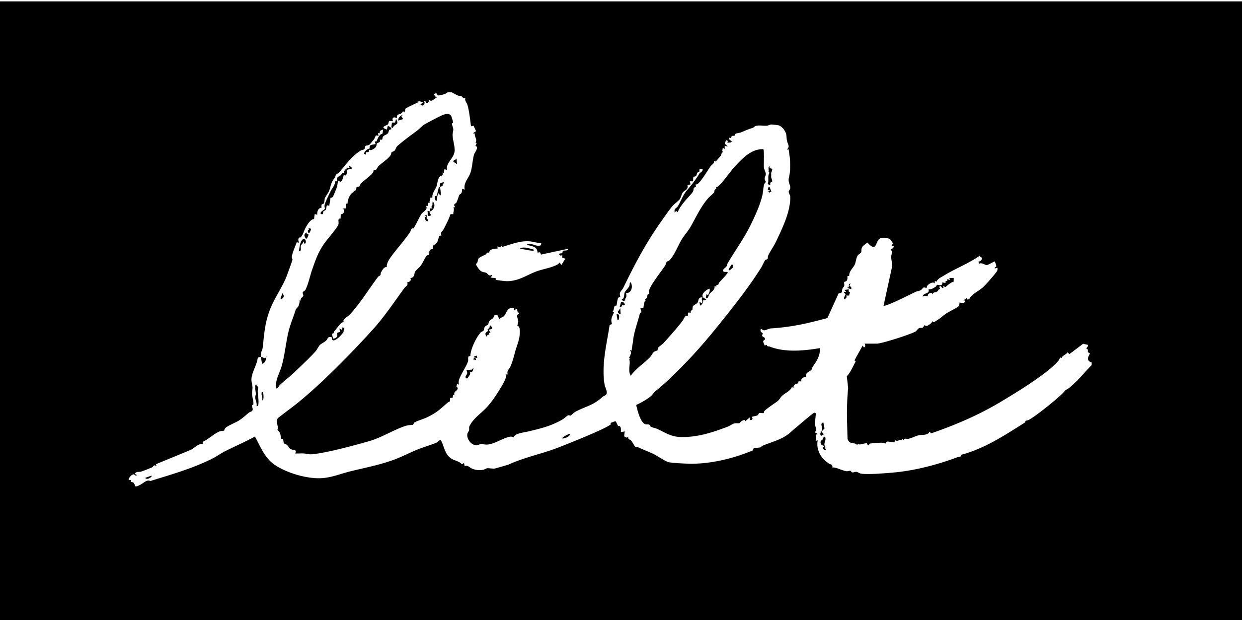
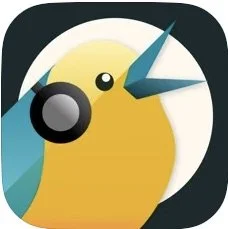
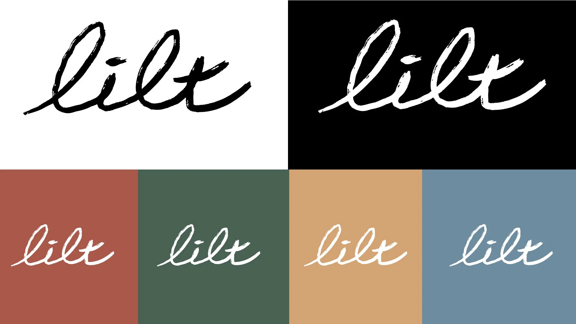
Branding and Iconography
The branding for Lilt is intentionally warm, tactile, and deeply rooted in the natural world. The hand-drawn logo and custom icons reflect the imperfections and organic textures of nature—nothing overly polished, just honest and human. Every element is designed to evoke the feeling of sketching in a field journal or jotting a note under a tree. The brand uses soft, earthy tones and sound-inspired visual cues to connect the user to both the environment around them and the subtle beauty of ambient sound. Lilt isn’t just a digital tool—it’s a sensory experience grounded in presence, memory, and the quiet rhythm of the outdoors.


LILT Audio Journal and App
LILT is a physical audio journal and accompanying app that allows users to go into nature and capture their memories through ambient sound. It offers a slower, more grounded way to document your journey through listening. By tuning into the natural world and collecting moments through sound, users are invited to be present, to observe, and to reconnect with their environment without relying on typical screen-based documentation.


Personal Insights
Creating a product that bridges the physical and digital while actively pushing back against the distractions of digital culture was a core challenge. The central tension was designing with technology, but not for screen-dependence.
That’s where the physical journal with an embedded microphone came into play a small object that keeps your phone in your pocket and your senses tuned outward. This taught me that innovation doesn’t always mean more features; sometimes it means restraint and intention.
Another key takeaway was the power of iteration. Great ideas rarely appear fully formed. The first concept for LILT looked very different than what it became. It was through sketching, testing, questioning, and rebuilding that the core of LILT revealed itself. Each round of iteration helped sharpen the connection to the “why” reminding me that iteration isn't just about refining visuals, it's about rediscovering meaning.
I also learned that building a brand from the ground up requires consistent alignment with purpose. It’s easy to get swept up in aesthetic decisions or flashy deliverables, but anchoring every creative choice to the deeper intent, helping people reconnect with nature, led to more meaningful and cohesive results.
