Roles / What I did
Research
Brand Strategy
Brand Building
Logo Creation
Marketing
Packaging Design
Overview
This Clif Bar rebrand taps into the gritty, no-frills spirit of ultra-crunchy outdoor diehards and ski bums who live for the next big push. Built around the idea of rugged, adventure-ready fuel that won’t break the bank, the brand is repositioned to serve those who chase storms, summit peaks, and carve first tracks. With bold, no-BS packaging and a tone that speaks the language of dirtbags and diehards alike, Clif is reimagined as the go-to energy bar for high-performance sustenance in extreme conditions on any trail, mountain, or slope.
Tools
Illustrator
Photoshop
Sketchbook
Procreate
Why a Re-brand?
Clif Bar has long been a staple in the outdoor energy category, but in today’s oversaturated market, crowded with sleek wellness brands, trendy protein snacks, and performance-focused competitors, it risks blending in. The original brand, while iconic, felt generic and broad in a space now defined by specificity and identity. This rebrand answers that challenge by narrowing Clif’s focus to speak directly to a core, passionate audience: ultra-crunchy outdoor enthusiasts and ski bums who live for the elements. By embracing this niche, Clif isn’t trying to please everyone; it’s owning a distinct space and culture that values grit, affordability, and adventure over polish. In doing so, the brand stands out not just for what it offers, but for who it’s for.

Competitive Analysis
Clif Bar operates in a highly competitive landscape, going head-to-head with brands like RXBAR and KIND, all of which offer cleaner aesthetics and often tout minimalist ingredients or functional benefits. Newer entrants like Bobo’s and GoMacro lean heavily into wellness, lifestyle, or niche performance messaging, often with higher price points and boutique branding. While Clif has legacy recognition and wide distribution, it risks feeling outdated or overly commercial to today’s more design-conscious and community-driven consumers. This rebrand helps Clif carve out a unique space by doubling down on authenticity and ruggedness, appealing to a core outdoor subculture that values function, affordability, and real-deal adventure over trendiness or polish.


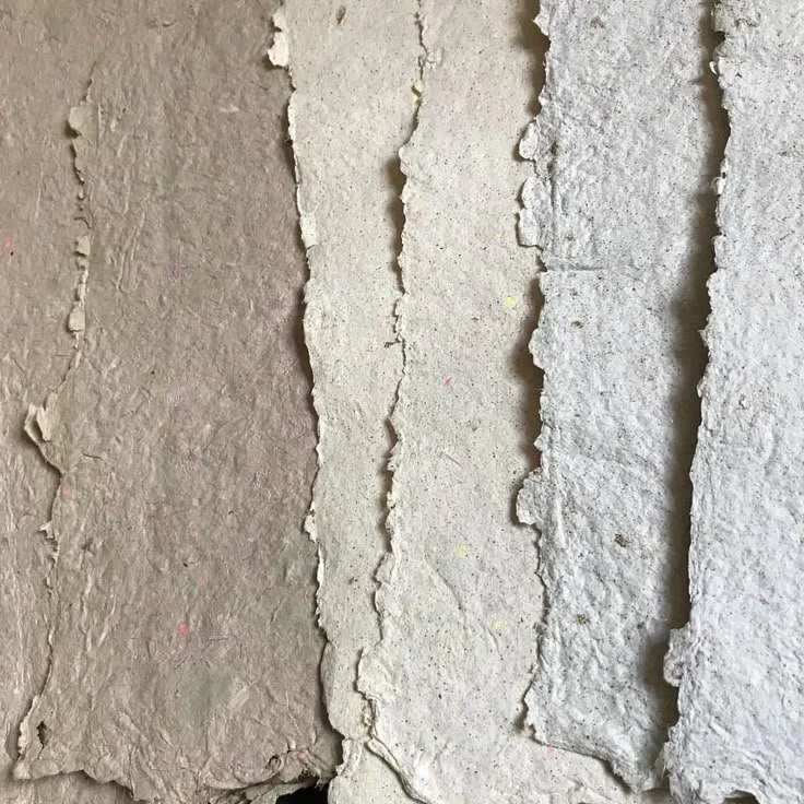
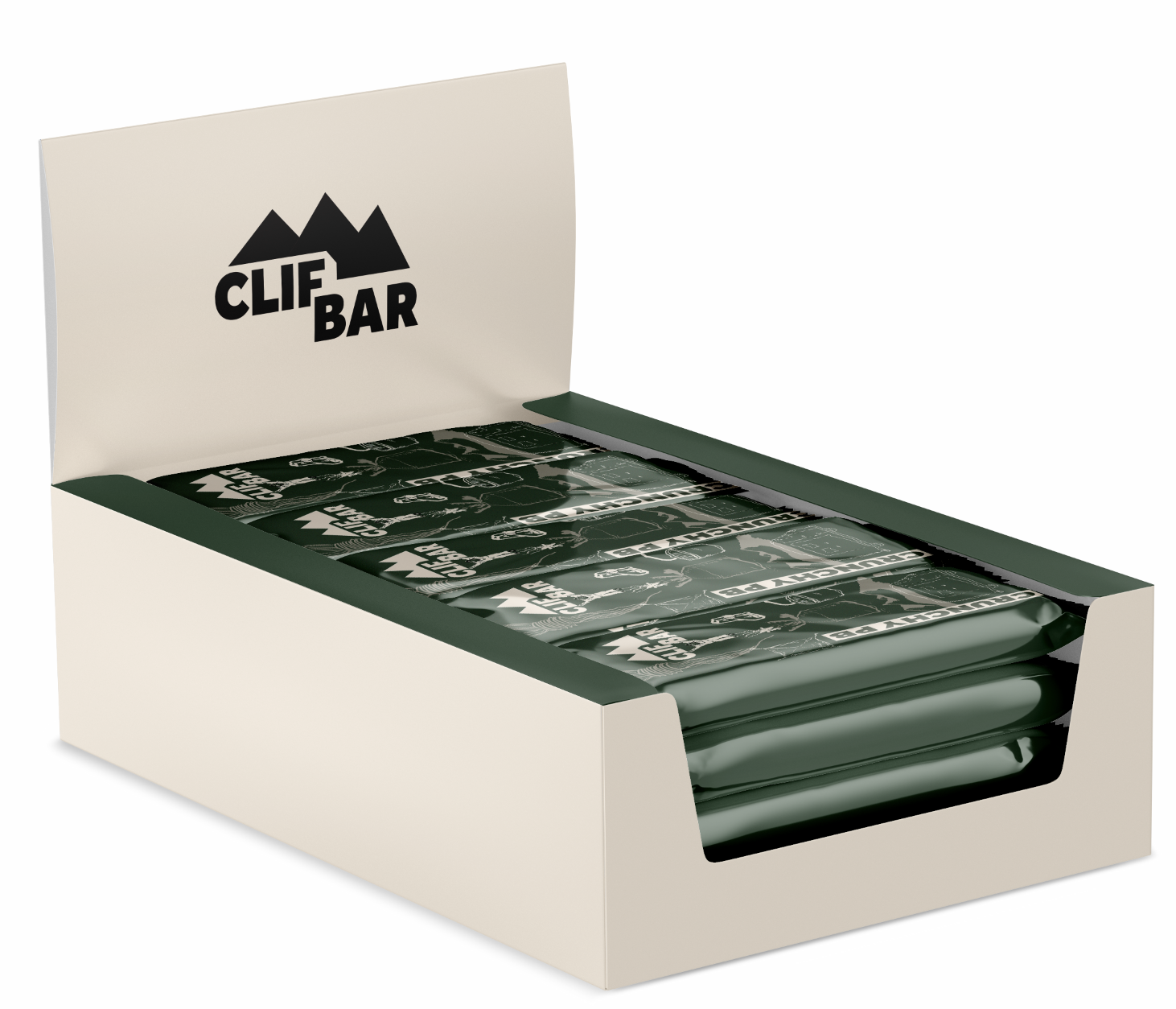
Recycled Cardboard Paper Packaging
How the Rebrand Came to Life
The Clif Bar rebrand came to life through a process rooted in research, lived experience, and hands-on making. It began with deep dives into audience insights, competitor audits, and cultural trends within the outdoor and dirtbag communities. From there, initial sketches explored raw, expressive directions that felt true to the grit and scrappiness of the lifestyle. Hand-drawn illustrations were developed to reflect that same energy—imperfect, bold, and full of motion. These visual elements were then brought into the packaging system, where layout, color, and typography were refined to balance utility with personality. The final deliverables included a full suite of bar packaging, a brand guide, lifestyle mockups, and marketing collateral—each piece reinforcing the new positioning and speaking directly to Clif’s core audience of trail-hardened adventurers.
Branding and Illustrations
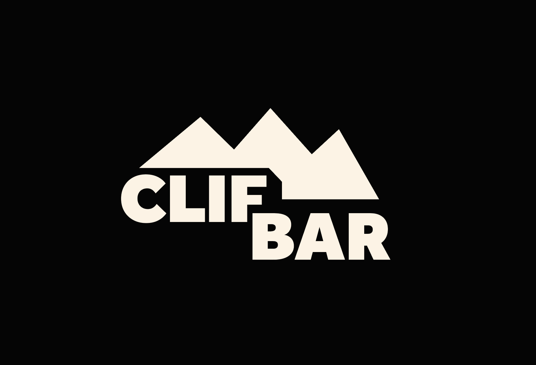
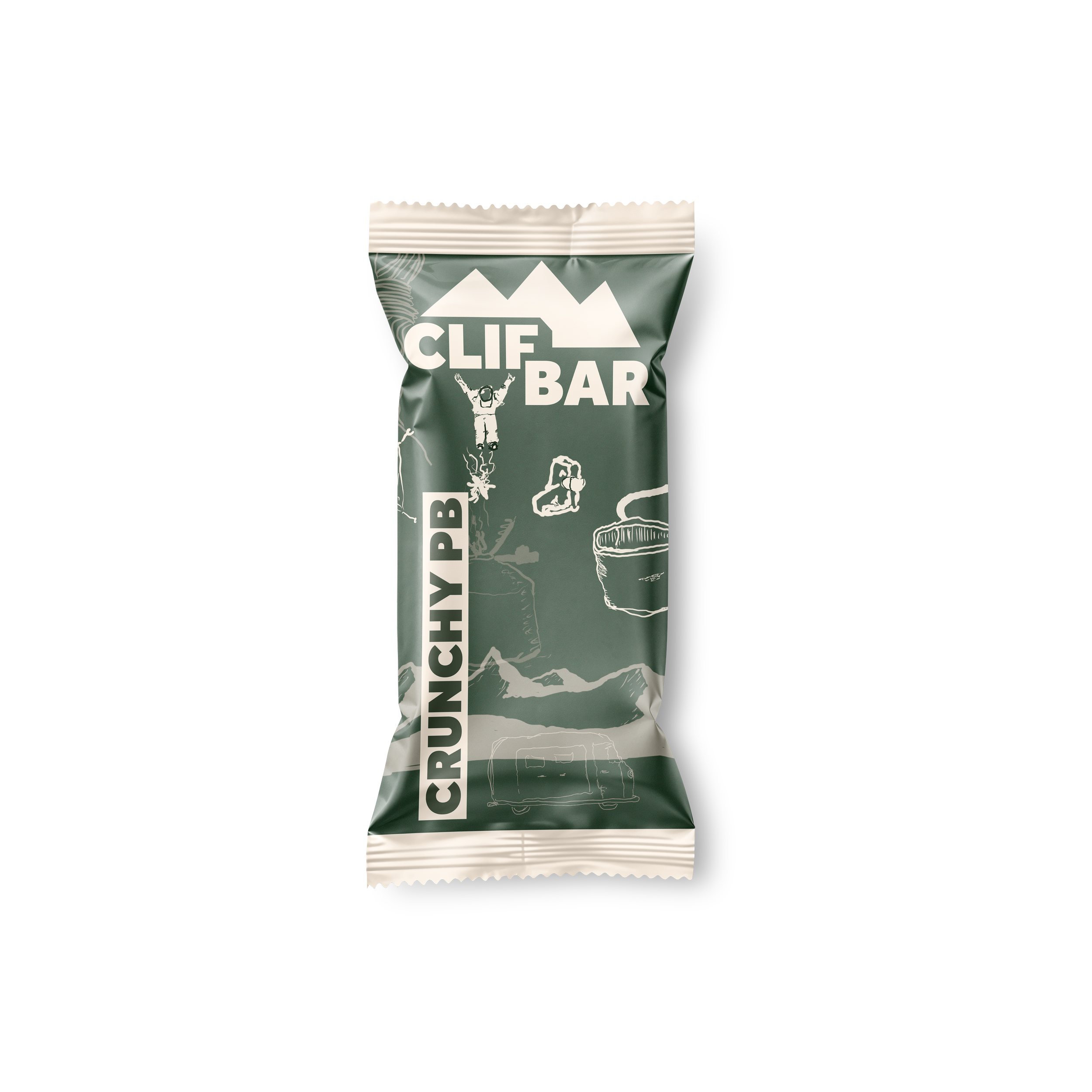
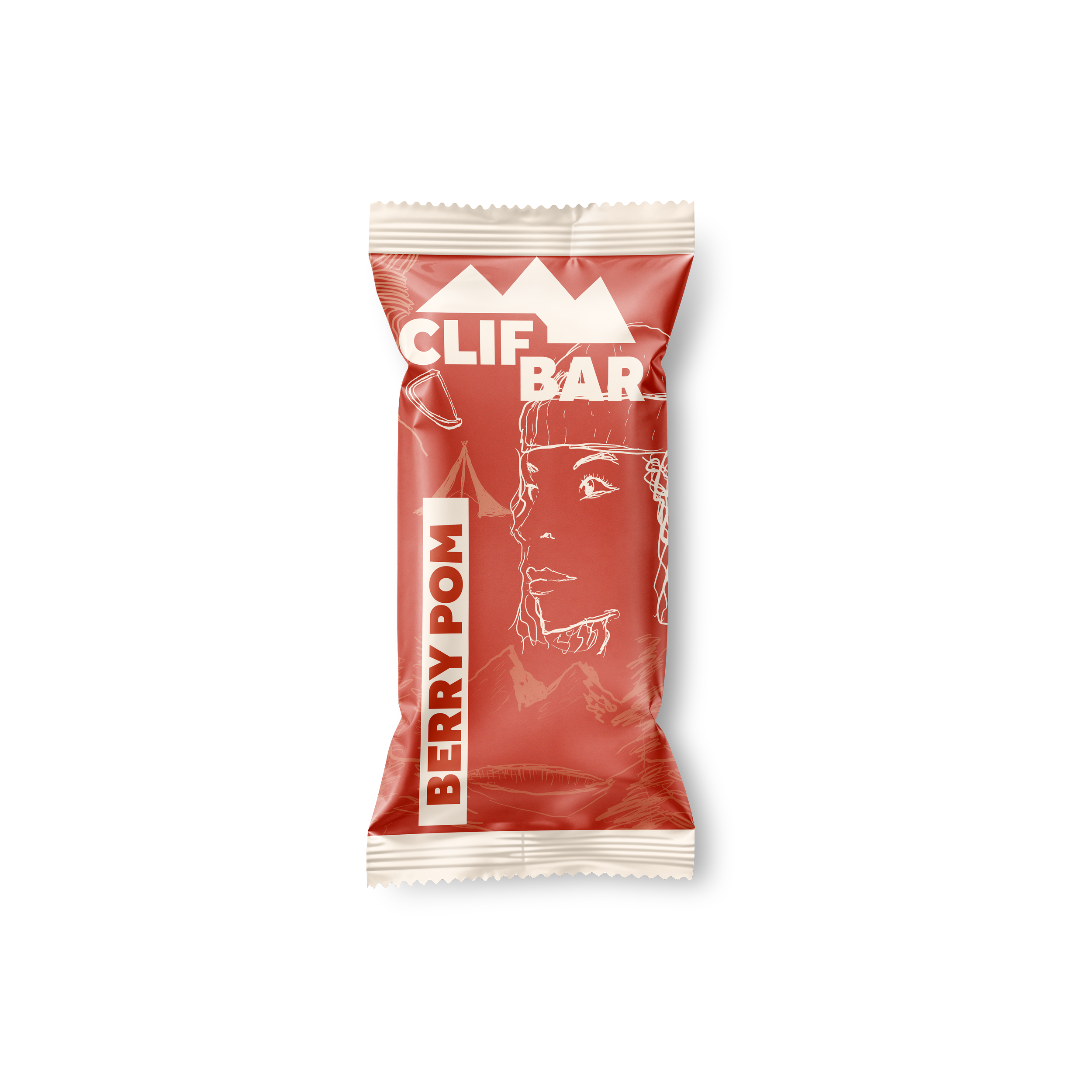
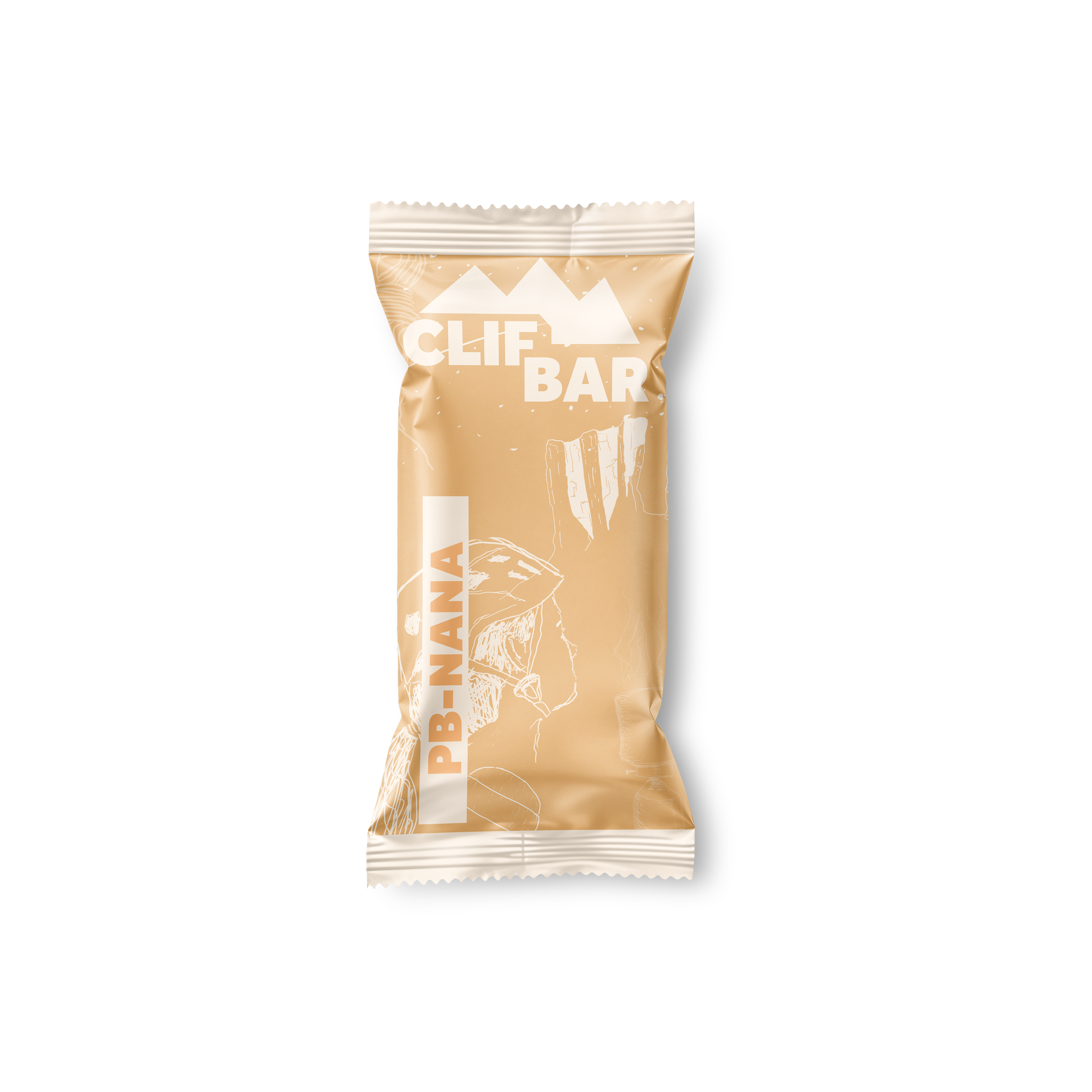
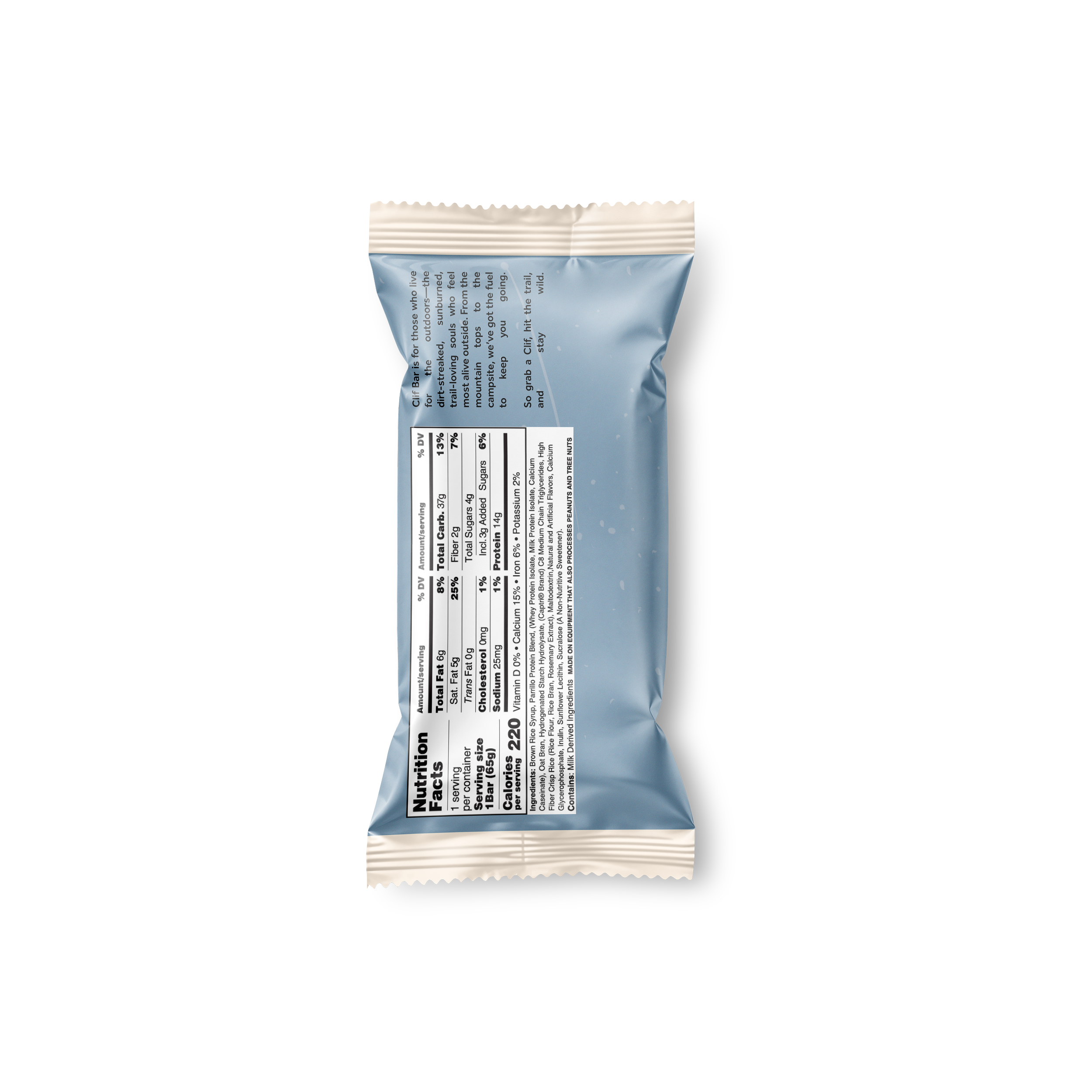
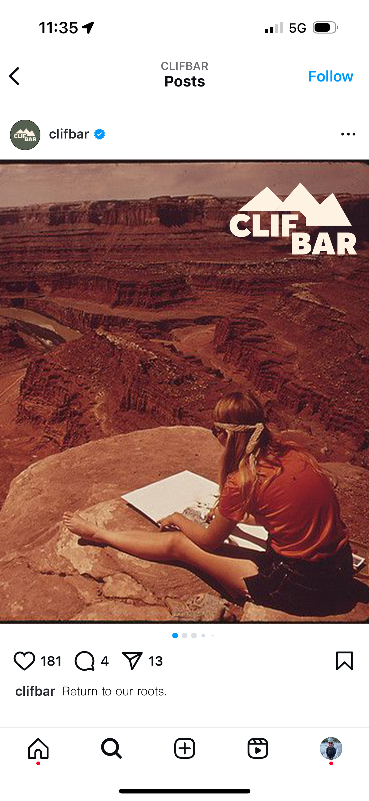
The Clif Bar rebrand uses bold, rugged visuals to reflect its core audience of outdoor diehards. The simplified mountain logo and strong, modern Effra typeface convey strength and clarity. Earthy tones like forest green, canyon red, and dusty blue pull from real outdoor environments, while hand-drawn illustrations add a raw, lived-in feel. Together, the system captures the grit, utility, and energy of life out in nature.


The Packaging
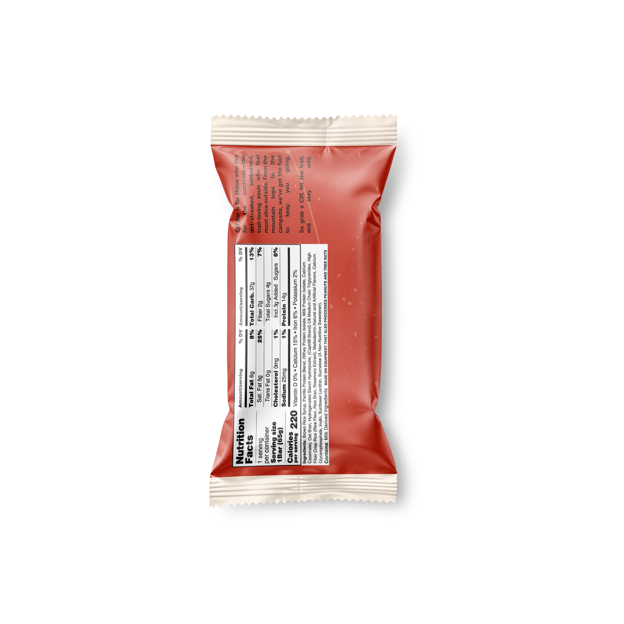
The packaging was designed with sustainability and simplicity at its core. Each wrapper is made from recycled cardboard material, giving it a natural cream base tone that aligns with the brand’s rugged, eco-conscious values. Rather than full-color printing, each flavor uses just one sustainable dye, minimizing environmental impact while creating bold shelf presence through color blocking. The result is a package that feels raw, intentional, and true to the no-frills lifestyle of Clif’s community.


Who this Brand is for
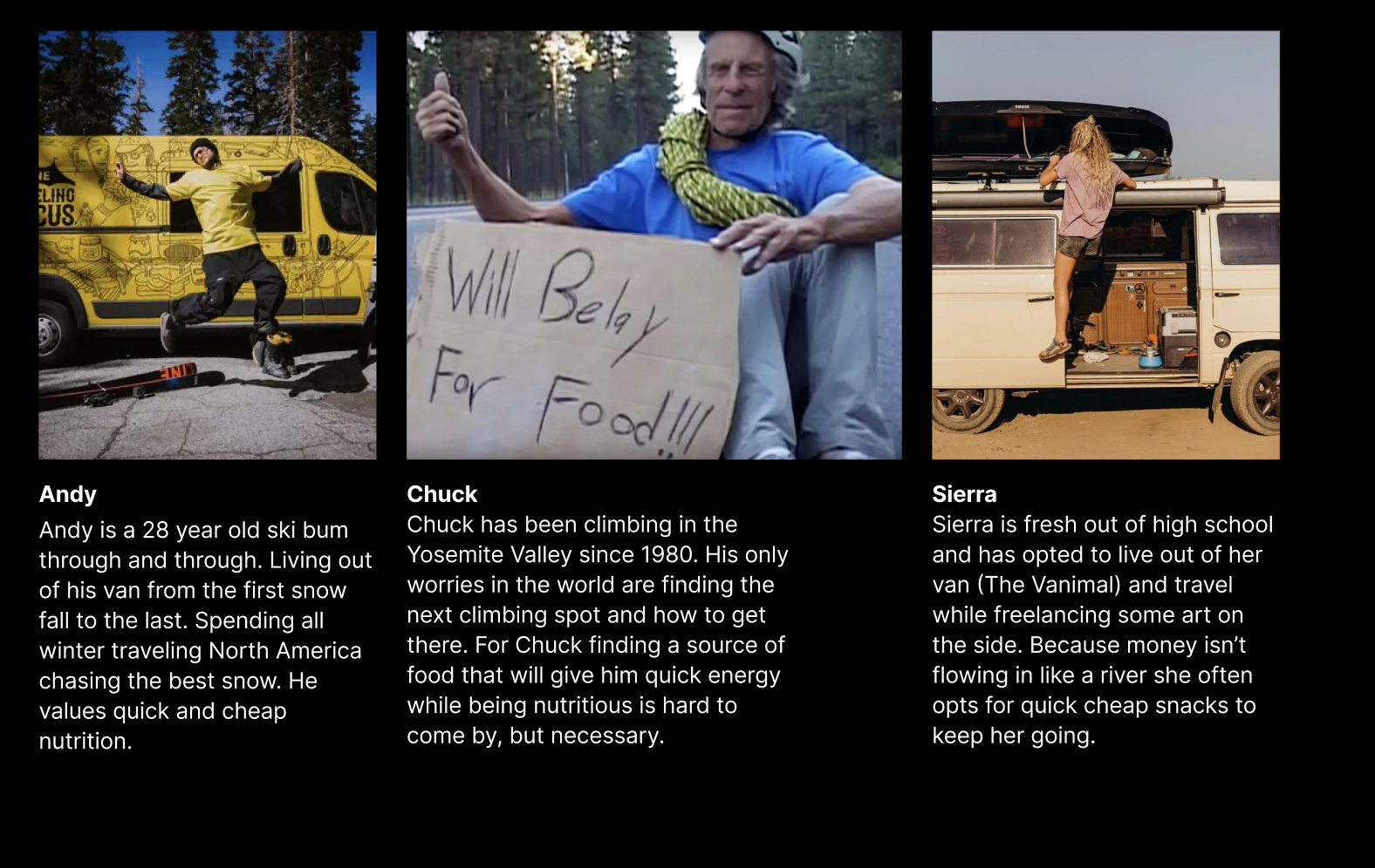
Meet Andy, Chuck, and Sierra, three core personas who shaped the heart of this Clif Bar rebrand. Andy is a nomadic ski bum chasing powder all winter, Chuck is a seasoned Yosemite climber with a no-frills lifestyle, and Sierra is a young van-lifer carving her path through art and exploration. Each of them lives on the edge of the outdoors, valuing affordable, high-energy snacks that fit their unpredictable, movement-heavy routines. Their grit, resourcefulness, and deep connection to the outdoors informed every design decision from the rugged aesthetic and approachable tone to the emphasis on portability and nutrition. The result is a brand that meets them where they are on the road, on the wall, or chasing the next storm.

Outcomes and Insights
This rebrand reinforced the power of grounding design in real research and audience understanding. By diving deep into the lives of core users and the shifting outdoor market, I was able to create a brand that feels authentic, relevant, and resonant. It showed me how aligning visual direction with lived behaviors, not just trends, can drive stronger, more intentional outcomes. Additionally, designing with sustainability in mind pushed me to consider not just how something looks, but how it functions in the world. From eco-conscious materials to low-impact production choices, this project taught me how design can play a meaningful role in reducing waste while still making a bold impact.